Here are a few bits and pieces that I discovered this year and enjoyed especially. In Part 1: Artivism, Coding, Data Visualisation, Language, Journalism, Technology and Women in Tech.
Art as activism
There’s many, many more out there - here are just a few of my favourites.

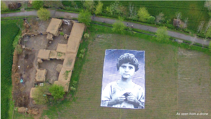
- Above: Not A Bug Splat, a giant art installation that targets predator drone operators, is a really powerful example of art as political activism, and created by an artist collective in Pakistan and the US.
- @blprnt started collecting some great examples of data/ethics/privacy art projects in this list.
- Hack the Art World was a great response to Google’s efforts at “DevArt”.
- People quote people is an interesting play on the notion of ‘authorship’ and accreditation. By Paolo Cirio, who has a lot of other great art/activism projects.
Coding
There are lots of collections of these, so I’m not going to start a new one here; instead, just a couple of my favourites, that I actually used this year.
- Learning CSS selectors with fun and food, by @flukeout
- An excellent tutorial on building a Jekyll site, by Andrew Munsell.. I followed this all the way through to build this site!
- Visualising Git with D3: a lovely, interactive, explanatory tool, by Wei Wang.
- Somewhat contradictory, but I like a lot about this article on why “No, you don’t need to learn to code”.
Data visualisation
I really hadn’t realised how much I look out for, and really admire, good data visualisations. Generally, they fall into one of two categories: ones which highlight issues that would otherwise be all too easy to ignore; or, those making complicated information more understandable.
- Turning the tables on the Sochi Winter Olympics, this site created some new sports and prizes for people who benefited from the most expensive Winter Olympics of all time. A playful and accessible way of highlighting corrupt practices, made by the Anti Corruption Foundation.
- A project highlighting what public transport networks actually look like for those with limited accessibility; from a group that work on urban planning, data visualisation and mapping based in Hamburg, check out their blog at Mappable.info.
- The Migrants Files, bringing together data on people who have died on their way to Europe. A project on Detective.io, by J++.
- This interactive circle plot showing migration flows, is great, and there’s also a version specifically for migration in Germany, too. By Nikola Sander and Ramon Bauer.
- Infographic on How powerful is your passport showing clearly the travel freedom that holders of different passports enjoy.
- The incredible journey of a broken TV, traced via GPS from Germany to Ghana. More than anything, this highlights how broken our society’s relationship is with hardware.[de]
- I imagine this would only be a really interesting piece if you were already a little interested in the topic - which I am, so it’s great. A scrolly, data-driven piece from Guardian Global Development, on global remittances..

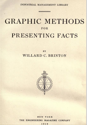
- Data visualisation has been around for a lot longer than I had thought: here’s a book from 1914, available in full to read online, full of visualisation tips, called “Graphic methods for presenting facts.” Hurray for the Internet Archive!
- I still can’t look at this without getting a lump in my throat: the most heart-wrenching map I’ve ever seen, with videos, letters, and messages from the families of the 43 missing students from Ayotzinapa, Mexico. Aptly called ‘Geografia del Dolor’, or Geography of Pain.
- This map shows places where publicly available food can be found in Germany- like places to pick fruit, find nuts, or wild herbs. I’ve yet to try it out, but I’m looking forward to doing so.
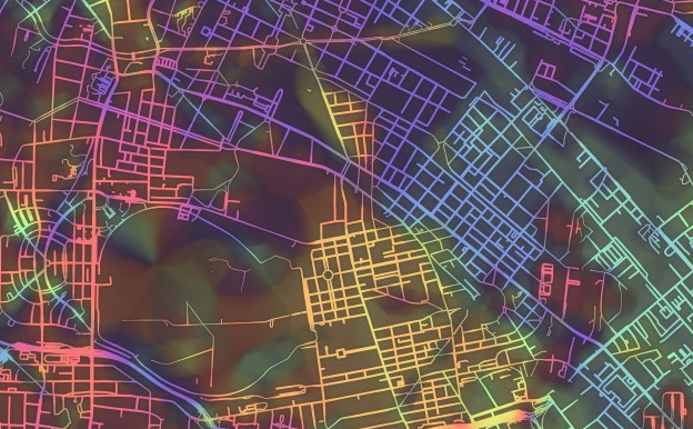
- There’s no shortage of visualisations of maps, but here are some especially pretty ones: city maps coloured by street orientation., by Stephen Von Worley. Turns out that Berlin is beautifully angled! (Below - Tempelhoferfeld)

- This post on Slow Travel Berlin has lots of links and images of how Berlin’s transit system has been visualised since it was created - it’s a fascinating read, especially if you know the city.
- Not strictly data visualisation, but I can imagine for people living in New York there’s hours of fun to be had with this map portal, which provides over 20,000 historical maps free to download + remix.
- Again, not strictly data viz - but this is a beautiful exercise, getting you to identify cities by their light signature. by Rose Eveleth for Nautilus..
- A great collection of physical interpretations of data through history.
Language

- A brilliant long read on research into the science of learning languages, by Michael Erard.
- A visualisation project graphing the position of English letters in words, by David Taylor.
- An art project on the utterly ludricous use of language analysis to determine veracity of asylum applications.
- A visualisation project chronicling how terminology and language from the UNHCR has changed over the last 64 years.
- A guide on internationalisation of personal names ;if you work with people from different cultures, this is especially interesting.
- Chronicle: a tool visualising language use in New York Times news coverage throughout its history.
- Tube tongues, an interactive map showing languages spoken at different tube stops in London, by Oliver O’Brien.
Design
I’m no designer - so, wherever I can, I try to keep an eye out for things that will make my life easier.
- I discovered the brilliant Font Awesome this year, and haven’t stopped using it since. A completely free set of icons, provided through one font.
- Ditto for the Noun Project for more specific icons - they have a great range, and lots available in the public domain.
- Beautiful Web Type - a curated selection of the best Google web fonts, by Chad Mazzola.
Videos
This year, I tried for the first time to experiment with new formats of conveying messages or explaining concepts, for example with Lego stop motion vidoes, or Vines, and I discovered that (unsurprisingly) it all took a lot longer than I had thought. Here are some examples of videos made by people who have mastered the art of explaining complicated concepts in clever ways!
- A fun animated video explaining the history of copyright.
- An paper-letter animation on the History of Typography, by Ben Barrett-Forrest (So clever!)
- Another animation - this time, from people I know well - explaining Freedom of Information and the German Freedom of Information platform, Frag den Staat [de].Video by Sam Muirhead, whose work - which is all done with open source tools, and openly licensed material- I can only recommend.
- The saddest use of Lego you ever have seen - Greenpeace turning the tables on the ‘Everything is Awesome’ lego movie slogan, as as a protest against their collaboration with Shell.
Journalism
Mainly lists of resources, and a couple of articles. I also love that lots of people who are giving data journalism courses at universities are making their course syllabus/materials available online.
- A really comprehensive reading list on Data Driven Journalism, compiled by Dan Nguyen.
- Also by Dan, this site for his course on Public Affairs Data Journalism, with the stated aim of “learning how to argue with and against data” has so much stuff I want to read!
- A treasure trove of journalism tools can be found on this Pinterest @journalism2ls pinterest page , by Ezra Eeman.
- A great beginners’ guide for journalists on understanding and using APIs, by Chrys Wu
- A really great post on getting a job in the world of news nerds/journo coders by Jeremy B. Merrill and Sisi Wei.
- A very, very comprehensive bibliography on media impact, by Brian Abelson. I’m interested in seeing how many of the conclusions drawn from the study of media impact could be applied to the impact of global development projects… but first, I have to read some more.
Technology articles
- “No, Nate, brogrammers may not be macho, but that’s not all there is to it” - I love this piece by Zeynep Tufekci on gender and tech, and not just because she quotes Dr Seuss.
- A great post, which I’ve referred to multiple times this year, on the metaphors used in email encryption + how this affects people’s use of it, by Arvind Narayanan. I’m a big fan generally of the Freedom to Tinker blog, too.
- On the problems of data on sexual violence in conflict, by Maya Ganesh
- On research into gratitude and “thanks technologies”, by Nate Matias.
- On data ethics in urban planning - The City is not a Lab, by Leah Meisterlin
- On Legitimacy, Place and the Anthropology of the Internet, by Sarah Kendzior.
- The Living with Data series on Al Jazeera America, a “field guide to the data and algorithms that shape our world”, by Sara M. Watson.
- The reading list from the Ethics of Data in Civil Society conference, held earlier this year at Stanford, is pretty full of thoughtful pieces.
- Recommended resources and reading from the “Digitally Connected” event hosted by the Berkman Center and UNICEF.
- A gorgeous graphic novel on big data + privacy, by Michael Keller.
Women in Tech
To my discomfort, most of these articles are from US-based writers. I’d love to read more from people based in other parts of the world, writing on the topic of women in technology - please send me recommendations of people or blogs to follow!
- On why lots (though not all) of well-intentioned women in tech initiatives are actually doing more harm than good, by Lea Verou.
- An open letter on feminism in tech, by a group of US-based feminists.
- A really powerful article on nerd culture and misogyny- “Your Princess is in another castle”, by Arthur Chu.
- Practical advice for men on how to help combat online sexism, by Leigh Alexander
- 10 Indian women scientists to be proud of, by Ierene Francis.