Across the global development sector, the idea of opening up data and becoming more transparent is taking hold. One might even say that it has become reasonably well established; almost every week, new data portals commissioned by global development organisations are appearing.
Undoubtedly, this move towards transparency and open data is, in theory, a positive development. Responsibly sharing data on global development projects is potentially, a crucial step towards more effective international development projects, both in terms of more efficient development programming on the side of the practitioner, and in terms of increasing accountability for citizens affected by projects.
So surely the flourishing online data portals are a good thing?
Not entirely. While the intentions are undoubtedly good, the results are often much less so.
Take, for example, the new mapping portal from the African Development Bank, Map Africa. To accompany the launch, they produced an explanatory video. Their intentions for MapAfrica are thus made clear, with taglines such as:
- If a picture is worth 1000 words… then visualising data helps us better understand.
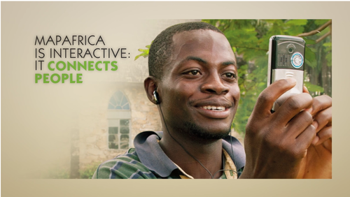
- MapAfrica is interactive: it connects people.
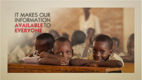
- It makes our information available to everyone.
- And shows how we are improving Africans’ lives.
- It empowers citizens to build better lives, and demand accountability.
Now, let’s look at the platform.
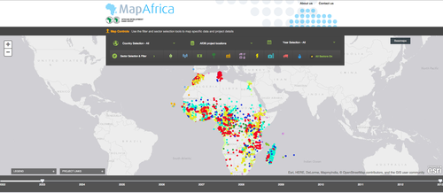
A map of the world, with a lot of coloured dots in African countries. What do the dots mean? Clicking on one brings up a pop up that looks something like this.
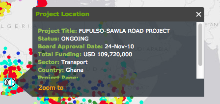
We’re starting the wrong way round on this analysis: but why would that information be useful? The ‘total funding’ figure given doesn’t make clear to which organisation the funding is going, so there’s no chance of tracking the financial flow. The ‘Project Page’ link is empty (and I’ve yet to find a single one), so there’s no further information given on the project. There’s no contact details given, nor the name of the partner organisation, so if a user wanted to ask a question or report a problem with the project, finding out who to contact - and thus ‘demanding accountability’ would be difficult, if not impossible.
My question, then: how exactly is this contributing to any of the goals stated above?
I’d suggest that perhaps they’re not; at least, not as well as they could be. What it is doing, is making the AfDB’s intentions at being a transparent organisation visible. It provides them with something to point at when asked about their transparency and open data policies, and it provides them with their own, easily identifiable and unique portal.
But these are the wrong targets to aim for. Putting data online should be about far more than simply lip service to transparency, and instead focus on how to best make the data useful, and accessible, to the desired target audience.
Tools developers within the global development sector could learn a lot from the civic software movement; many of the guidelines in CivicPatterns are very relevant here, especially those in the Delivery and Engagement sections. For example - build it they won’t come, or do your homework - I wonder how often those who are tasked with building a new data portal actually take the time to see what is already out there, and learn from their work. (Incidentally - this is one issue that the Tools section of the Open Development Toolkit site that I work on is trying to address, by bringing them together in one place)
Of course, learning from each other and building upon each others work would be a lot easier were the code for these portals made open source. Currently, very few development data portals actually are - DFID’s DevTracker for one, and Development Initiatives’ d-portal for another. Public money should be spent towards creating a public infrastructure, not to create proprietary bits of software that can’t be reused, aren’t maintained, and go quickly out of date.
Again, we could learn a lot from other related movements here - the Poplus project’s efforts at building independent pieces of software that can be used and remixed, for example.
Basic software development guidelines aren’t being followed: how many tools developers would be able to easily identify their target audience? And let’s be clear here: “the public” is not a target audience. Let’s be honest, too - the chances of the average citizen in a heavily aid-recipient country ever coming across a development data portal are very low. The potential audience waiting to be tapped here is elsewhere; civil society organisations and journalists with an interest in financial spending in low-income countries, for example. Topic-specific researchers looking into how different initiatives are supported in certain countries. Fellow global development practitioners, looking to join forces. Even citizens of rich countries, wanting to know where their tax money is being spent.
Where is the research on what kinds of information potential target audiences are wanting to find out? Personally, I’ve yet to see any. Some user testing happens after the development of a new portal - but by then, it’s usually too late to change very much. Even earlier than this should come the first consideration: is a data portal what is needed here? Nathaniel Heller of Global Integrity makes some great points here on the topic of building toolboxes - many of which would be relevant considerations for building individual tools, too.
I’ve singled out MapAfrica here because I came across it for the first time recently, but it is by no means the worst example of resources used under the well-meaning aim of making development data “accessible” with not so useful results. We’re at a point now where we need to start being more nuanced about how, and why, this data is going online, who it is for, and whether the tools we are building are in fact meeting their needs.